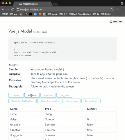
##### Simple to use, highly customizable, mobile friendly Vue.js 2.0+ modal with SSR support. http://vue-js-modal.yev.io/
[Changelog on Medium](https://medium.com/@yev_dev/vue-js-modal-changelog-61f934691b67 "Medium")
Demo: http://vue-js-modal.yev.io/
### Install
```bash
npm install vue-js-modal --save
```
### How to use
Include plugin in your `main.js` file.
```javascript
import VModal from 'vue-js-modal'
Vue.use(VModal)
/*
By default plugin will use "modal" name for the component.
If you need to change it, you can do so by providing "componentName" param.
Example:
Vue.use(VModal, { componentName: "foo-modal" })
...
*/
```
Create modal:
```vue
hello, world!
```
Call it from anywhere in the app:
```javascript
methods: {
show () {
this.$modal.show('hello-world');
},
hide () {
this.$modal.hide('hello-world');
}
}
```
---
You can easily send data into the modal:
```javascript
this.$modal.show('hello-world', { foo: 'bar' })
```
And receive it in `beforeOpen` event handler:
```vue
```
```javascript
methods: {
beforeOpen (event) {
console.log(event.params.foo);
}
}
```
If you use **Bower** package manager - you will have to initialize library differently:
```js
Vue.use(window["vue-js-modal"].default);
```
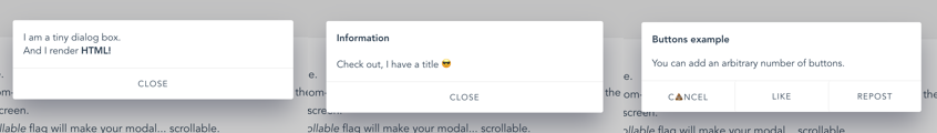
### Dialog
It is a simplified version of the modal, which has most parameters set by default and is pretty useful for quick prototyping, showing alerts or creating mobile-like modals.
To start using `` you must set `dialog: true` in plugin configuration:
```js
Vue.use(VModal, { dialog: true })
```
And include it in your project:
```vue
```
Call it (all params except of “text” are optional):
```javascript
this.$modal.show('dialog', {
title: 'Alert!',
text: 'You are too awesome',
buttons: [
{
title: 'Deal with it',
handler: () => { alert('Woot!') }
},
{
title: '', // Button title
default: true, // Will be triggered by default if 'Enter' pressed.
handler: () => {} // Button click handler
},
{
title: 'Close'
}
]
})
```
### Dynamic Modals
In order to instantiate modals at runtime (for lazy-loading or decluttering templates), it is possible to create modals dynamically.
To start using this feature you must set `dynamic: true` in plugin configuration:
```js
Vue.use(VModal, { dynamic: true })
```
And include the `` component it in your project:
```vue
```
Call it (the first argument is the component definition, the second are component properties, the third modal parameters, and the fourth the modal event listeners):
```javascript
this.$modal.show({
template: `
This is created inline
{{ text }}
`,
props: ['text']
}, {
text: 'This text is passed as a property'
}, {
height: 'auto'
}, {
'before-close': (event) => { console.log('this will be called before the modal closes'); }
})
```
It can also be used with `.vue` files:
```javascript
import MyComponent from './MyComponent.vue'
this.$modal.show(MyComponent, {
text: 'This text is passed as a property'
}, {
draggable: true
})
```
Other than defining the `name` modal parameter, it's also possible to close dynamic modals emitting a `'close'` event:
```javascript
this.$modal.show({
template: `
Close using this button:
`
})
```
For more examples please take a look at [vue-js-modal.yev.io](http://vue-js-modal.yev.io).
**Note:** keep in mind that there are some limitations for using dynamic modals. If you need full functionality then use ordinary modal instead.
### SSR
Include plugin in your `nuxt.config.js` file:
```javascript
module.exports = {
plugins: ['~plugins/vue-js-modal']
}
```
And your `plugins/vue-js-modal.js` will look like:
```javascript
import Vue from 'vue'
import VModal from 'vue-js-modal/dist/ssr.index'
Vue.use(VModal)
```
For full demo please look at `demo/server_side_rendering`
### Extracted CSS
There is also a ssr build with css file extracted. Take a look in /dist folder.
### Properties
| Name | Required | Type | Default | Description |
| --- | --- | --- | --- | --- |
| name | true | [String, Number] | | Name of the modal |
| delay | false | Number | 0 | Delay between showing overlay and actual modal box |
| resizable | false | Boolean | false | If true, allows to resize modal window, keeping it in the center of the screen. |
| adaptive | false | Boolean | false | If true, modal box will try to adapt to the window size |
| draggable | false | [Boolean, String]| false | If true, modal box will be draggable. |
| scrollable | false | Boolean | false | If `height` property is `auto` and the modal height exceeds window height - you will be able to scroll modal |
| reset | false | Boolean | false | Resets position and size before showing modal |
| clickToClose | false | Boolean | true | If set to `false`, it will not be possible to close modal by clicking on the background |
| transition| false | String | | Transition name |
| classes | false | [String, Array] | 'v--modal'| Classes that will be applied to the actual modal box, if not specified, the default 'vue--modal' class will be applied |
| width | false | [String, Number] | 600 | Width in pixels or percents (e.g. 50 or "50px", "50%") |
| height | false | [String, Number] | 300 | Height in pixels or percents (e.g. 50 or "50px", "50%") or `"auto"` |
| minWidth | false | Number (px) | 0 | The minimum width to which modal can be resized |
| minHeight | false | Number (px) | 0 | The minimum height to which modal can be resized |
| maxWidth | false | Number (px) | Infinity | The maximum width of the modal (if the value is greater than window width, window width will be used instead |
| maxHeight | false | Number (px) | Infinity | The maximum height of the modal (if the value is greater than window height, window height will be used instead |
| pivotX | false | Number (0 - 1.0) | 0.5 | Horizontal position in %, default is 0.5 (meaning that modal box will be in the middle (50% from left) of the window |
| pivotY | false | Number (0 - 1.0) | 0.5 | Vertical position in %, default is 0.5 (meaning that modal box will be in the middle (50% from top) of the window |
### Events
| Name | Description |
| --- | --- |
| before-open | Emits while modal is still invisible, but was added to the DOM |
| opened | Emits after modal became visible or started transition |
| before-close | Emits before modal is going to be closed. Can be stopped from the event listener calling `event.stop()` (example: you are creating a text editor, and want to stop closisng and ask user to correct mistakes if text is not valid)
| closed | Emits right before modal is destoyed |
Example:
```vue
{{time}}
```
Example with a dynamic modal:
```vue
export default {
name: 'ExampleModal',
data () {
return {
time: 0,
duration: 5000
}
},
methods: {
openModal () {
this.$modal.show({
template: `{{time}}`,
props: ['time']
}, {
time: this.time
}, {
width: 300,
height: 300
}, {
'before-open': this.beforeOpen,
'before-close': this.beforeClose
})
},
beforeOpen (event) {
console.log(event)
// Set the opening time of the modal
this.time = Date.now()
},
beforeClose (event) {
console.log(event)
// If modal was open less then 5000 ms - prevent closing it
if (this.time + this.duration < Date.now()) {
event.stop()
}
}
}
}
```
This example, initializes `time` variable every time the modal is being opened.
And then forbits closing it for the next 5000 ms
### Other
#### Height: "auto"
From `v1.2.6` height can be set to "auto". If you want to be able to scroll modal in case it's height exceeds window height - you can set flag `scrollable="true"`.
p.s. `scrollable` will only work with `height="auto"`.
Example:
```vue
...
```
Auto height:
Scrollable content & auto height:
#### Close button
If you want to have a Close (x) button in the top-right corner, you can use "top-right" slot for it. There is deliberately no predefined Close button style - you will have to implement/use your own button.
Example:
```vue
Hello, ☀️!
```
#### Draggable handler
Draggable property can accept not only `Boolean` but also `String` paramenters. With `String` value, you can specify a CSS selector to the element which will be a "handler" for dragging.
Example:
```vue
DRAG ME HERE
Hello, 🌎!
```
#### Overlay background color
If you want to change overlay background color, you can easily do it using css.
For all modals:
```css
.v--modal-overlay {
background: red;
}
```
For specific modal:
```css
.v--modal-overlay[data-modal="my_modal_name"] {
background: transparent;
}
```
#### Fullscreen
```vue
Dont forget about close button :)
```
### Check out
Check out my other projects:
* https://github.com/euvl/vue-notification
* https://github.com/euvl/vue-js-toggle-button
* https://github.com/euvl/vue-js-popover
* https://github.com/euvl/v-clipboard
### Developers
To run an example:
```sh
# Clone repo
git clone https://github.com/euvl/vue-js-modal.git
# Run unit tests
npm run unit
# Run linter
npm run lint
# Build main library for client & ssr
cd vue-js-modal
npm install
npm run build
# Build and run demo
cd demo/client_side_rendering
npm install
npm run dev
```