# Vue.js 2.0+ modal
[](https://badge.fury.io/js/vue-js-modal)
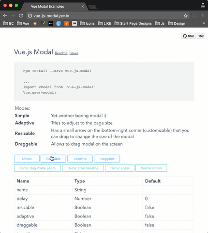
##### Simple to use, highly customizable, mobile friendly Vue.js 2.0+ modal. http://vue-js-modal.yev.io/
Demo: http://vue-js-modal.yev.io/
### Install
```bash
npm install vue-js-modal --save
```
### How to use
Include plugin in your `main.js` file.
```javascript
import vmodal from 'vue-js-modal'
Vue.use(vmodal)
```
Create modal:
```html
hello, world!
```
Call it from anywhere in the app:
```javascript
methods: {
show () {
this.$modal.show('hello-world');
},
hide () {
this.$modal.hide('hello-world');
}
}
```
### SSR
Include plugin in your `nuxt.config.js` file:
```javascript
module.exports = {
plugins: ['~plugins/vue-js-modal']
}
```
And your `plugins/vue-js-modal.js` will look like:
```javascript
import Vue from 'vue'
import VModal from 'vue-js-modal/dist/ssr.index'
Vue.use(VModal)
```
For full demo please look at `demo/server_side_rendering`
### Properties
| Name | Required | Type | Default | Description |
| --- | --- | --- | --- | --- |
| name | true | [String, Number] | | Name of the modal |
| delay | false | Number | 0 | Delay between showing overlay and actual modal box |
| resizable | false | Boolean | false | If true, allows to resize modal window, keeping it in the center of the screen. |
| adaptive | false | Boolean | false | If true, modal box will try to adapt to the window size |
| draggable | false | [Boolean, String]| false | If true, modal box will be draggable. |
| transition| false | String | | Transition name |
| classes | false | [String, Array] | 'vue--modal'| Classes that will be applied to the actual modal box, if not specified, the default 'vue--modal' class will be applied |
| width | false | Number | 600 | |
| height | false | Number | 300 | |
| minWidth | false | Number | 0 | The minimum width to which modal can be resized |
| minHeight | false | Number | 0 | The minimum height to which modal can be resized |
| pivotX | false | Number (0 - 1.0) | 0.5 | Horizontal position in %, default is 0.5 (meaning that modal box will be in the middle (50% from top) of the window |
| pivotY | false | Number (0 - 1.0) | 0.5 | |
### Events
| Name | Description |
| --- | --- |
| before-open | Emits while modal is still invisible, but was added to the DOM |
| opened | Emits after modal became visible or started transition |
| before-close | Emits before modal is going to be closed. Can be stopped from the event listener calling `event.stop()` (example: you are creating a text editor, and want to stop closisng and ask user to correct mistakes if text is not valid)
| closed | Emits right before modal is destoyed |
Example:
```vue
{{time}}
```
This example, initializes `time` variable every time the modal is being opened.
And then forbits closing it for the next 5000 ms
### Other
#### Close button
If you want to have a Close (x) button in the top-right corner, you can use "top-right" slot for it. There is deliberately no predefined Close button style - you will have to implement/use your own button.
Example:
```vue
Hello, ☀️!
```
#### Draggable handler
Draggable property can accept not only `Boolean` but also `String` paramenters. With `String` value, you can specify a CSS selector to the element which will be a "handler" for dragging.
Example:
```vue
DRAG ME HERE
Hello, 🌎!
```
### Developers
To run an example:
```sh
# Clone repo
git clone https://github.com/euvl/vue-js-modal.git
# Build main library
cd vue-js-modal
npm install
npm run build
# Build and run demo
cd demo
npm install
npm run dev
```